





We (Emil Hvitfeldt, Jeroen Janssens, Michael Chow, and I) just got back from PyCon US 2026, and there was so much buzz around Polars . What is Polars? Why should I switch to Polars? How do I switch to Polars?
I mean, just check out the line for the book signing of Jeroen’s book, Python Polars: The Definitive Guide .
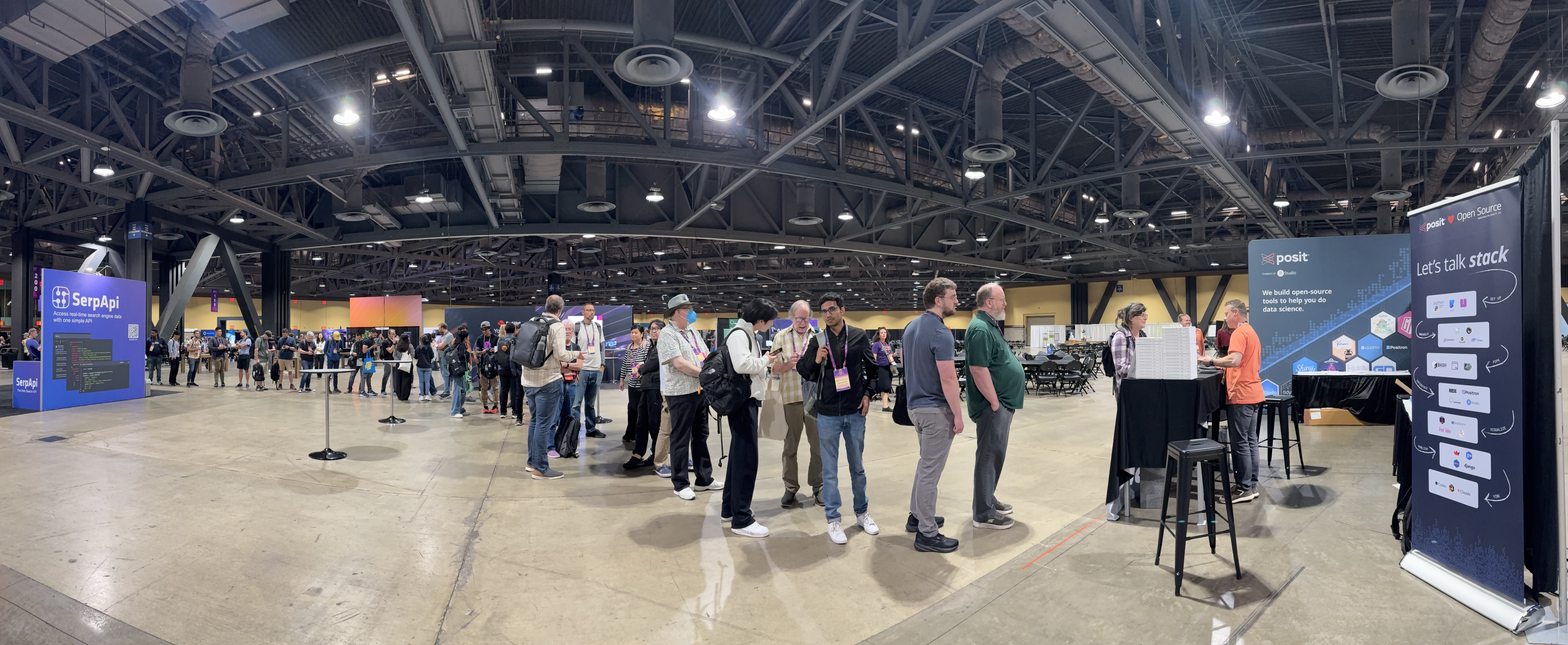
If Polars is new to you, it is a library for efficient data manipulation in Python. It’s built on Rust, so it’s super fast. And a lot of people (including the creator of Pandas !) like the intuitive way you write Polars code. However, if you work in Python, you might know that different DataFrames have different requirements, so you want to make sure to use libraries that support Polars (I admit, I come from the R world, and this was mind blowing to me).
And, we’re happy to say that we (Posit) have excellent Polars support across our Python libraries for every stage of the data science workflow! In this post, we’ll walk through four:
- pointblank for data validation and quality checks
- Great Tables for creating publication-quality tables
- plotnine for ggplot2-style visualizations
- mall for LLM-powered data analysis
Let’s check them out!
Setup#
First, let’s install the libraries:
pip install polars great_tables pointblank plotnine mlverse-mallNow, import what we need:
import polars as pl
from great_tables import GT
import pointblank as pb
from plotnine import (
    ggplot, aes, geom_point, geom_line, geom_bar, geom_text, geom_col,
    labs, theme_minimal, theme, element_text, scale_fill_manual,
    scale_y_continuous, element_rect, element_blank, element_line,
    scale_color_manual, position_dodge, annotate
)
import mall
The dataset#
We’ll demonstrate these tools using sales_data, a sample sales dataset:
sales_data = pl.DataFrame({
    "date": ["2026-01-15", "2026-01-16", "2026-01-17", "2026-01-18",
             "2026-01-19", "2026-01-20", "2026-01-21"],
    "region": ["North", "South", "North", "West", "South", "North", "West"],
    "product": ["Widget A", "Widget B", "Widget A", "Widget C",
                "Widget B", "Widget A", "Widget C"],
    "sales": [1200, 1800, 1500, 2100, 1650, 1900, 2300],
    "units_sold": [24, 36, 30, 42, 33, 38, 46],
    "customer_rating": [4.5, 4.8, 4.6, 4.9, 4.7, 4.8, 4.9]
}).with_columns(
    pl.col("date").str.strptime(pl.Date, "%Y-%m-%d")
)

sales_data| date | region | product | sales | units_sold | customer_rating |
|---|---|---|---|---|---|
| date | str | str | i64 | i64 | f64 |
| 2026-01-15 | "North" | "Widget A" | 1200 | 24 | 4.5 |
| 2026-01-16 | "South" | "Widget B" | 1800 | 36 | 4.8 |
| 2026-01-17 | "North" | "Widget A" | 1500 | 30 | 4.6 |
| 2026-01-18 | "West" | "Widget C" | 2100 | 42 | 4.9 |
| 2026-01-19 | "South" | "Widget B" | 1650 | 33 | 4.7 |
| 2026-01-20 | "North" | "Widget A" | 1900 | 38 | 4.8 |
| 2026-01-21 | "West" | "Widget C" | 2300 | 46 | 4.9 |
We can confirm that it is, indeed, a Polars DataFrame!
isinstance(sales_data, pl.DataFrame)True
Data validation with pointblank#
Let’s now validate our data quality using pointblank :
agent = (
    pb.Validate(sales_data)
    .col_vals_not_null(columns="date")
    .col_vals_between(columns="sales", left=0, right=10000)
    .col_vals_between(columns="customer_rating", left=1.0, right=5.0)
    .col_vals_in_set(columns="region", set=["North", "South", "East", "West"])
    .interrogate()
)

agent| Pointblank Validation | |||||||||||||
2026-05-29|21:34:38 Polars |
|||||||||||||
| STEP | COLUMNS | VALUES | TBL | EVAL | UNITS | PASS | FAIL | W | E | C | EXT | ||
|---|---|---|---|---|---|---|---|---|---|---|---|---|---|
| #4CA64C | 1 |
col_vals_not_null()
|
✓ | 7 | 7 1.00 |
0 0.00 |
— | — | — | — | |||
| #4CA64C | 2 |
col_vals_between()
|
✓ | 7 | 7 1.00 |
0 0.00 |
— | — | — | — | |||
| #4CA64C | 3 |
col_vals_between()
|
✓ | 7 | 7 1.00 |
0 0.00 |
— | — | — | — | |||
| #4CA64C | 4 |
col_vals_in_set()
|
✓ | 7 | 7 1.00 |
0 0.00 |
— | — | — | — | |||
2026-05-29 21:34:38 UTC< 1 s2026-05-29 21:34:38 UTC |
|||||||||||||
In natural language, the steps that the agent performs are:
- Validate the
sales_dataDataFrame - Make sure that no values in
Dateare null - Make sure that the values in
salesare between 0 and 10000 - Make sure that the values in
customer_ratingare between 1 and 5 - Make sure that the values in
regionare “North”, “South”, “East”, or “West” - Now, interrogate!
The resulting table lets us know for each step what was expected, how many values passed, the percentage of values that passed, and so on. And, the validation agent works directly with Polars DataFrames, no need to convert to pandas!
Also, about that nifty table that gets output? 👀 Directly in this blog post (written in Quarto )? That is Great Tables ! But Great Tables isn’t just for pointblank…
Creating beautiful tables with Great Tables#
Let’s summarize some data:
daily_summary = (
    sales_data.group_by("date")
    .agg(
        [
            pl.col("sales").sum().alias("total_sales"),
            pl.col("units_sold").sum().alias("total_units"),
            pl.col("customer_rating").mean().alias("avg_rating"),
        ]
    )
    .sort("date")
)

regional_summary = (
    sales_data.group_by("region")
    .agg(
        [
            pl.col("sales").sum().alias("total_sales"),
            pl.col("sales").mean().alias("avg_sales"),
            pl.col("units_sold").sum().alias("total_units"),
            pl.col("sales").alias("sales_trend"),
        ]
    )
    .sort("total_sales", descending=True)
)
Let’s present our regional summary in a ✨publication-quality table✨ using Great Tables:
from great_tables import loc, style

(
    GT(regional_summary)
    .tab_header(
        title="Regional Sales Performance",
        subtitle="Week of January 15-21, 2026"
    )
    .fmt_currency(
        columns=["total_sales", "avg_sales"],
        currency="USD"
    )
    .fmt_number(
        columns="total_units",
        decimals=0,
        sep_mark=","
    )
    .fmt_nanoplot(
        columns="sales_trend",
        plot_type="line",
        autoscale=True
    )
    .cols_label(
        region="Region",
        total_sales="Total Sales",
        avg_sales="Average Sale",
        total_units="Units Sold",
        sales_trend="Trend"
    )
    .data_color(
        columns="total_sales",
        palette=["#f0f0f0", "#447099"],
        domain=[1000, 5000]
    )
    .tab_style(
        style=style.text(weight="bold"),
        locations=loc.body(columns="region")
    )
    .tab_style(
        style=style.fill(color="#e8f4f8"),
        locations=loc.body(rows=[0])
    )
    .tab_source_note("Data validated with pointblank · Trend shows daily sales pattern")
    .tab_options(
        table_font_size="14px",
        heading_title_font_size="18px",
        heading_subtitle_font_size="14px"
    )
)| Regional Sales Performance | ||||
|---|---|---|---|---|
| Week of January 15-21, 2026 | ||||
| Region | Total Sales | Average Sale | Units Sold | Trend |
| North | $4,600.00 | $1,533.33 | 92 | |
| West | $4,400.00 | $2,200.00 | 88 | |
| South | $3,450.00 | $1,725.00 | 69 | |
| Data validated with pointblank · Trend shows daily sales pattern | ||||
In this example, Great Tables:
- Adds a title using
tab_header - Formats currency using
fmt_currency - Formats numbers using
fmt_number - Creates a nanoplot (a miniature line chart) using
fmt_nanoplot - Labels the columns using
cols_label - Edit color, styling, and font sizes with
data_color,tab_style, andtab_options - Add a source note using
tab_source_note
All with full Polars support! In fact, Great Tables is the
default way to style Polars DataFrames
, using df.style.
Visualizations with plotnine#
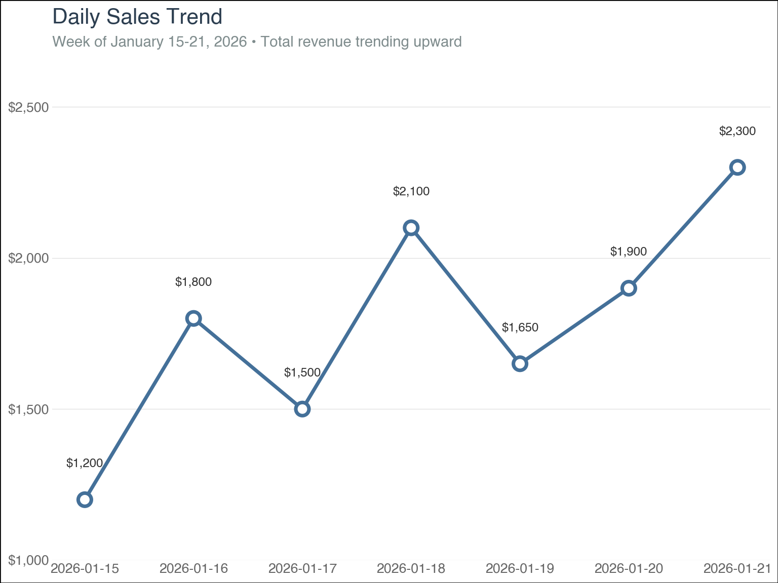
For visualizations, plotnine brings the grammar of graphics to Python. Let’s create some nice-looking plots:
Daily sales trend#
(
    ggplot(daily_summary, aes(x="date", y="total_sales"))
    + geom_line(color="#447099", size=1.5)
    + geom_point(color="#447099", size=4, fill="white", stroke=1.5)
    + geom_text(
        aes(label="total_sales"),
        va="bottom",
        nudge_y=100,
        size=9,
        color="#333333",
        format_string="${:,.0f}"
    )
    + scale_y_continuous(
        labels=lambda l: [f"${x:,.0f}" for x in l],
        limits=(1000, 2600),
        expand=(0, 0)
    )
    + labs(
        title="Daily Sales Trend",
        subtitle="Week of January 15-21, 2026 • Total revenue trending upward",
        x="",
        y=""
    )
    + theme_minimal()
    + theme(
        plot_title=element_text(size=16, weight="bold", color="#2c3e50"),
        plot_subtitle=element_text(size=11, color="#7f8c8d", margin={"b": 15}),
        axis_title_y=element_blank(),
        axis_text_y=element_text(size=10, color="#666666"),
        axis_text_x=element_text(size=10, color="#666666"),
        panel_grid_major_x=element_blank(),
        panel_grid_minor=element_blank(),
        panel_grid_major_y=element_line(color="#e0e0e0", size=0.5),
        plot_background=element_rect(fill="white"),
        panel_background=element_rect(fill="white"),
        figure_size=(8, 6)
    )
)
Sales by region and product#
# Custom color palette with Posit-inspired colors
product_colors = {
    "Widget A": "#447099",  # Blue
    "Widget B": "#72994e",  # Green
    "Widget C": "#c65d47",  # Rust
}

(
    ggplot(sales_data, aes(x="region", y="sales", fill="product"))
    + geom_col(position=position_dodge(width=0.8), width=0.7)
    + scale_fill_manual(values=product_colors)
    + scale_y_continuous(
        labels=lambda l: [f"${x:,.0f}" for x in l],
        limits=(0, 2500),
        breaks=range(0, 2501, 500),
        expand=(0, 0),
    )
    + labs(
        title="Sales Performance by Region",
        subtitle="Product comparison across geographic markets",
        x="",
        y="",
        fill="",
    )
    + theme_minimal()
    + theme(
        plot_title=element_text(size=16, weight="bold", color="#2c3e50"),
        plot_subtitle=element_text(size=11, color="#7f8c8d", margin={"b": 15}),
        axis_title=element_blank(),
        axis_text_y=element_text(size=10, color="#666666"),
        axis_text_x=element_text(size=11, color="#333333", weight="bold"),
        legend_position="top",
        legend_title=element_blank(),
        legend_text=element_text(size=10),
        legend_box_margin=0,
        panel_grid_major_x=element_blank(),
        panel_grid_minor=element_blank(),
        panel_grid_major_y=element_line(color="#e0e0e0", size=0.5),
        plot_background=element_rect(fill="white"),
        panel_background=element_rect(fill="white"),
        figure_size=(8, 6),
    )
)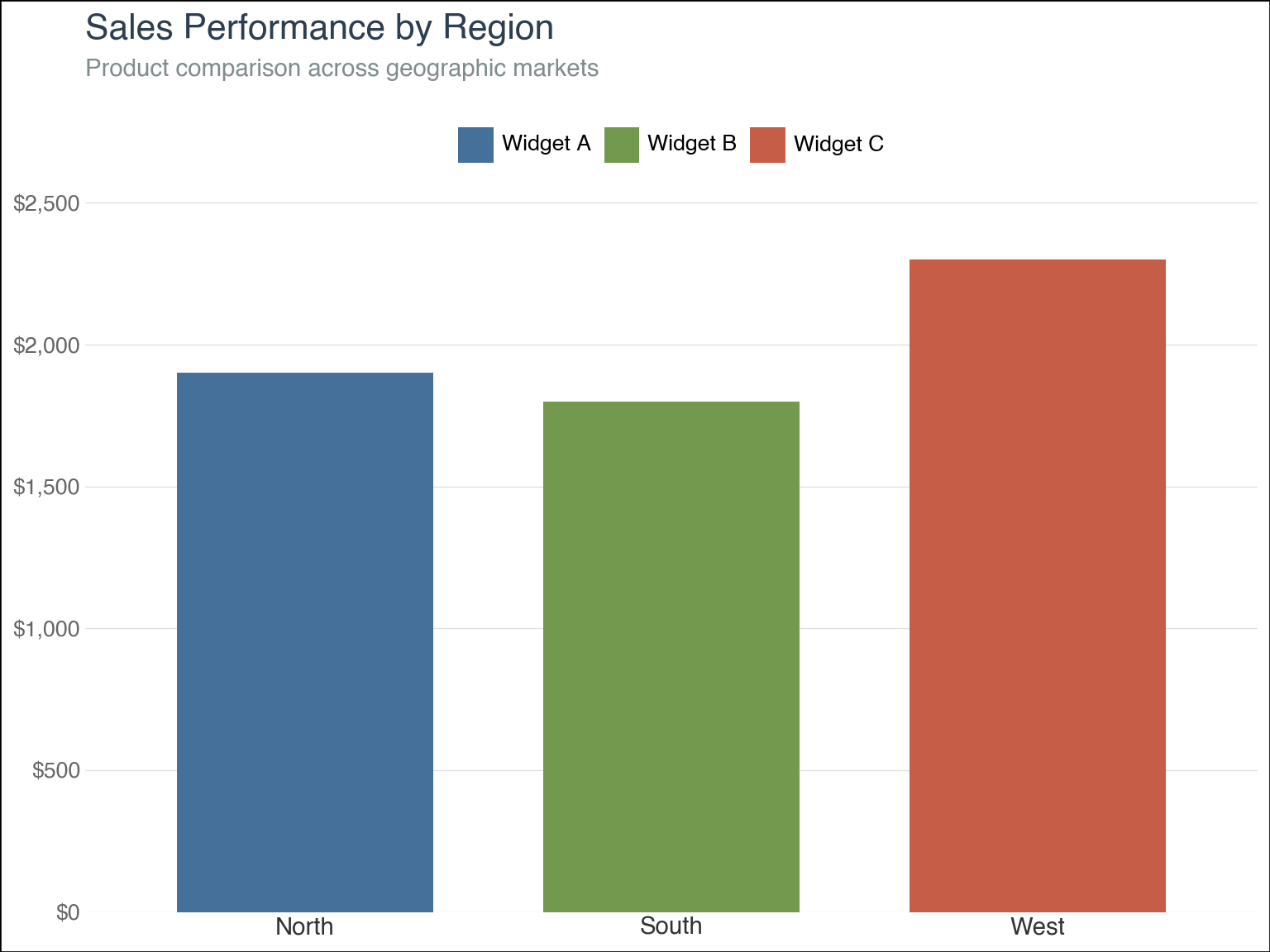
Plotnine works seamlessly with Polars DataFrames, no conversion needed! These visualizations can include:
- Values displayed directly on points for easy reading with
geom_text - Currency labels, appropriate limits, and controlled breaks with
scale_y_continuous - Larger, bolder titles with subtle subtitle styling with
theme - Pure white backgrounds with subtle gray gridlines with
theme_minimal(my favorite built-in theme)
Again, with full Polars support. There’s more about it in the Polars documentation for visualization .
AI-powered insights with mall#
Finally, let’s use mall to add LLM-powered analysis to our workflow. I used Ollama 1 with a local model, but mall works with OpenAI, Anthropic, and other providers through the chatlas package.
Mall extends Polars DataFrames with an .llm accessor that provides natural language operations. We can use mall to add natural language descriptions to our sales data, rating the performance of each row as “low”, “medium”, or “high”:
sales_data.llm.use("ollama", "llama3.2")

sales_with_performance = sales_data.llm.classify(
    "sales",
    ["high", "medium", "low"],
    pred_name="performance",
)

sales_with_performance.select(
    ["date", "region", "product", "sales", "performance"]
)| date | region | product | sales | performance |
|---|---|---|---|---|
| date | str | str | i64 | str |
| 2026-01-15 | "North" | "Widget A" | 1200 | "low" |
| 2026-01-16 | "South" | "Widget B" | 1800 | "low" |
| 2026-01-17 | "North" | "Widget A" | 1500 | "low" |
| 2026-01-18 | "West" | "Widget C" | 2100 | "low" |
| 2026-01-19 | "South" | "Widget B" | 1650 | "low" |
| 2026-01-20 | "North" | "Widget A" | 1900 | "low" |
| 2026-01-21 | "West" | "Widget C" | 2300 | "low" |
Or we can generate custom descriptions for each product:
sales_with_description = sales_data.llm.custom(
    "product",
    pred_name="description",
    prompt="Create a brief, compelling marketing description for this product in 10 words or less",
)

with pl.Config(fmt_str_lengths=200):
    print(sales_with_description.select(["product", "description"]))
shape: (7, 2)
┌──────────┬───────────────────────────────────────────────────────────────────────┐
│ product ┆ description │
│ --- ┆ --- │
│ str ┆ str │
╞══════════╪═══════════════════════════════════════════════════════════════════════╡
│ Widget A ┆ "Unlock innovative performance with Widget A - Simplify Your Space." │
│ Widget B ┆ "Unlock the Power of Widget B: Revolutionizing Your World." │
│ Widget A ┆ "Unlock innovative performance with Widget A - Simplify Your Space." │
│ Widget C ┆ "Unlock innovative possibilities with Widget C, designed to elevate." │
│ Widget B ┆ "Unlock the Power of Widget B: Revolutionizing Your World." │
│ Widget A ┆ "Unlock innovative performance with Widget A - Simplify Your Space." │
│ Widget C ┆ "Unlock innovative possibilities with Widget C, designed to elevate." │
└──────────┴───────────────────────────────────────────────────────────────────────┘
Mall has a bunch of other powerful operations you can use:
.llm.classify()— Categorize data into predefined labels.llm.sentiment()— Analyze sentiment (positive/negative/neutral).llm.summarize()— Condense text columns to key points.llm.extract()— Pull specific information from text.llm.translate()— Convert text to another language.llm.verify()— Check if statements are supported by data
And not surprisingly, mall keeps everything in Polars format, which means fast, AI-enhanced data operations that fit naturally into your Polars pipelines.
Wrapping up#
The Python data ecosystem has embraced Polars, and so has Posit! These four libraries show how we can build complete data workflows without ever leaving the Polars DataFrame format:
- pointblank — Ensure your data quality before analysis begins
- Great Tables — Create publication-ready tables with rich formatting options
- plotnine — Build beautiful, reproducible visualizations with the grammar of graphics
- mall — Integrate LLM capabilities directly into your data pipelines
All of these libraries work seamlessly with Polars, so you can stay in the fast, efficient world of Polars from start to finish. Hope you check them out!
Learn more#
-
For instructions, please review the Setting up local LLMs for R and Python blog post. ↩︎


